
Paint a couple hundred Warhammer miniatures, and you’ll start to have some opinions on how a miniature should be PROPERLY painted. For myself, I’ve dialed in on two main tenets which guide all my miniature painting:
- Don’t get better at painting, just get faster (or you’ll NEVER get your shit painted…better takes time).
- ALWAYS incorporate one very light color in your color scheme.
There is, of course, some skill in speed painting, but today I’ll focus on the second point: the importance of value contrast. Value, in color theory terms, is simply the relative lightness or darkness of the color one uses. When all colors are the same value, you end up with a fairly flat looking model, even under bright lights:

These early Plaguebearers I painted are fine, but the purple and green tones at exactly the same value are doing them no favors (especially because the green matches the basing material as well, causing the whole mini to blend together). If I ever paint more of these guys, I’ll definitely go for VERY light pale green, with darker purple splotches.
The same can be said for large parts of this Skaven Screaming Bell:

Thankfully I went for the giant slabs of green stone (even though, let’s be serious, a chunk of warpstone that big is a RIDICULOUS prospect) otherwise this model would have ended up a big brown mess. I wanted the metallic bits dirty, but forgot it would just bring their value (and hue) down to exactly match the wooden sections. I’m not sure the best solution here without decidedly un-Skaven bright metallics, but more value contrast to the main body of the wagon is definitely needed.
You can see an extreme example of all this in this quick and dirty Festus, the Leechlord (soon to be rereleased in giant size making this model obsolete) that I painted recently:
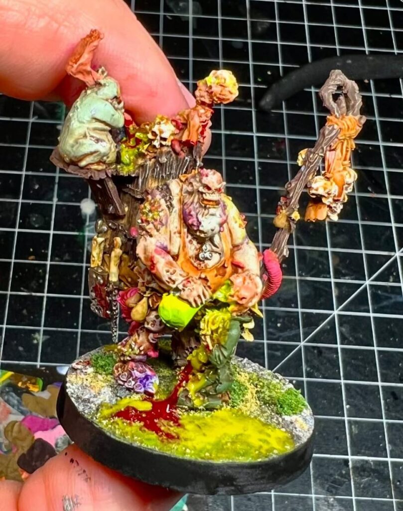
I think this paint scheme works well (especially considering this was not the strongest bootleg recast I’ve worked with), but the apron was bothering me. It looked realistic, but was blending into the paint scheme too much. So I tested out a much darker color and got this:
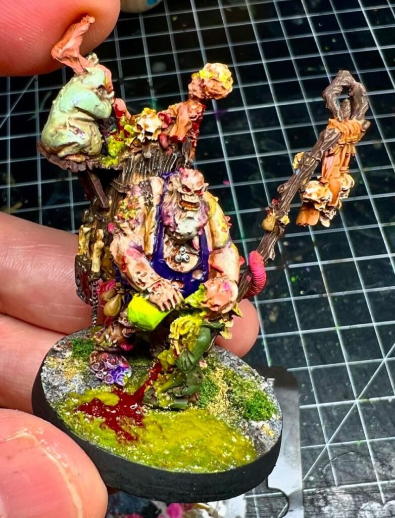
Sure, that color is a little garish (a dark brown would probably have been best, but I didn’t want it to seem like part of the wooden back pack), but the model immediately looks less flat with that one simple change.
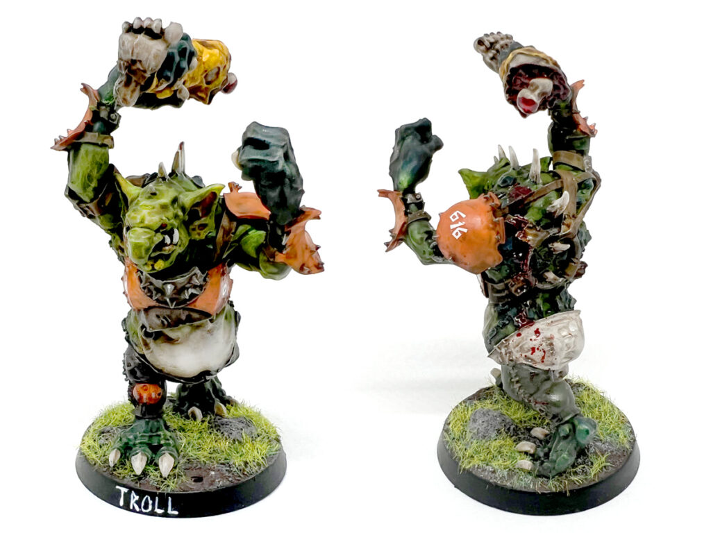
Anymore, I don’t start a new paint scheme without making sure to incorporate value extremes on the model. Whether it’s my Bloodbowl Armored Troll:
Or my latest Deathguard Plague Marine Army:
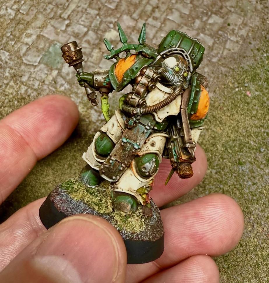
You are going to find contrasting areas of light and dark all over my models. Maybe someday I’ll go back and lighten up those Plaguebearers…of course, that would break my first rule of miniature painting: always prioritize speed over quality.
Leave A Reply