Before one is fully able to appreciate heavy metal as a genre, one must first come to terms with the ridiculous imagery that is an integral part of the metal experience. Through some strange alchemical process, a heady mixture of skulls, big hair, Tolkien, moose knuckles, Satan, “retarded sexuality, and bad poetry” fuses together to create metal’s certain unmistakeable je ne sais quois. The heavy metal album cover is the listener’s first exposure to this unique atmosphere, and a truly great album cover will add layers of juvenile titillation to the overall experience of listening to the album. Some covers are great, some are failures, and some, are are in a class of their own.
Today, we take a look at AttackeR’s seminal debut album, Battle at Helm’s Deep.
General impressions?
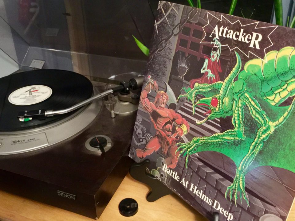
Alright, let’s start by just letting this cover sink in:
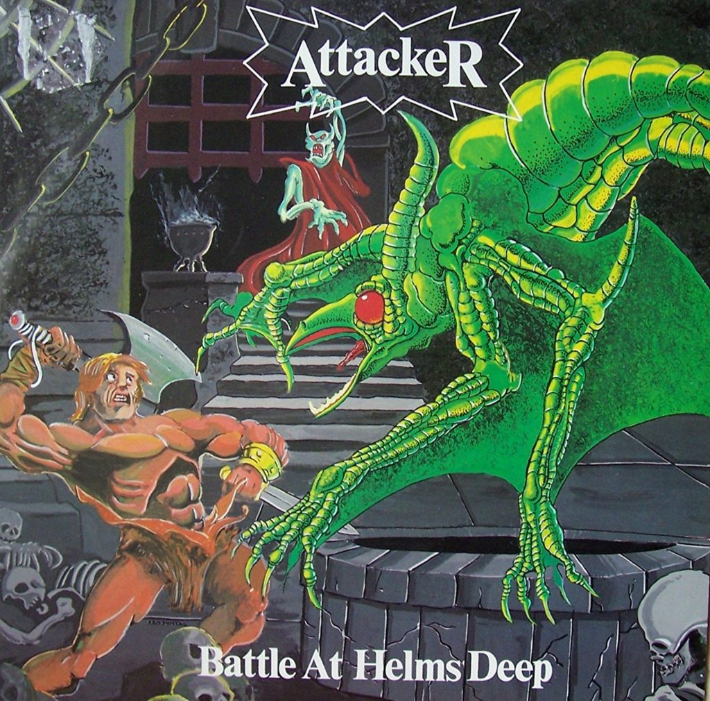
The first thing one learns when getting into metal is to appreciate a shittily painted cover. There is something just charmingly underground about an unskilled artist amateurishly stabbing at a canvas until vaguely pectoral shaped things begin to appear. So, on that level, this cover is rightfully considered an all-time classic.
And, honestly, that dragon-thing isn’t really the worst fantasy painting I’ve ever seen (relatively speaking), largely thanks to some reasonable pen and ink work over the paint. The barbarian, on the other hand, occupies that realm of bad fantasy art where you are just sure the artist must have been trying to paint a He-Man doll that has been left in the sun for too long. Of course, if you look at his pecs and think “that’s not how muscles work” just take a look at that sorry excuse for a Lich King in the back and try to figure out what the fuck is going on with his radius and ulna. If the unfinished pen and ink work wasn’t your first clue, that sloppy as shit Lich is a sure sign that this painting just barely met its deadline.
And, can we talk about that expression on the barbarian? I mean, if Conan and D&D have taught me anything, I know barbarians hate magic more than heavy metal artists hate proper anatomy, but, for a badass album cover, I think they went a little overboard with the loin-cloth shitting expression of terror on that dude’s face:
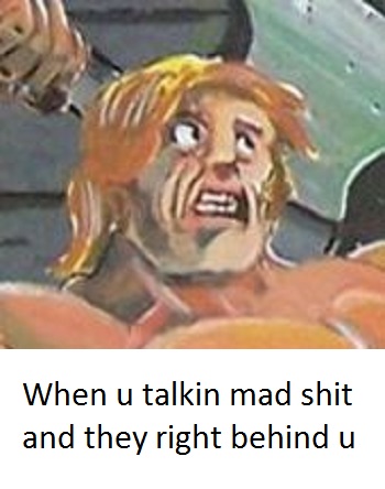
And, while the painting is so bad it’s probably good, the logo is so bad it’s just bad. I mean, how lazy do you have to be as a band to say “fuck it, Times New Roman, and then like draw a star around it…oh, and capitalize the last letter to tie it all together!” I mean, what the fuck, the logo is ALWAYS the first thing a band does, even before putting up a flier looking for a bass player that also has a van. This seriously is up there with Vark Vikernes deciding “fuck it, I’ll just go with Papyrus,” when it comes to laziest metal logos.
What’s on the back?
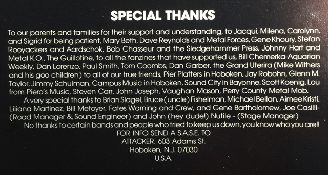
The back of this album is pretty standard. Front and center is the usual thanks list that hits all the metal album thank list classics, from ambiguous nicknames (what the fuck are “goo children”?), to ambiguous shout outs (hey dude!), to ambiguous disses (YOU KNOW WHO YOU ARE):
Surrounding this are poorly framed and lit pictures of the band. Let’s take a look at each of these:

“Am I tooching my booty enough to achieve the proper level of sass?”
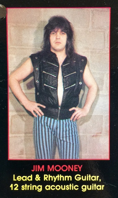
“Does this vest hide my belly? Maybe if I unzip it a bit? And don’t forget to mention my 12-string!”
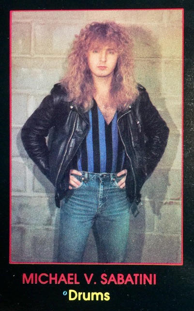
“Is my v-neck low enough? No? Here, let me pull my pants up higher…”
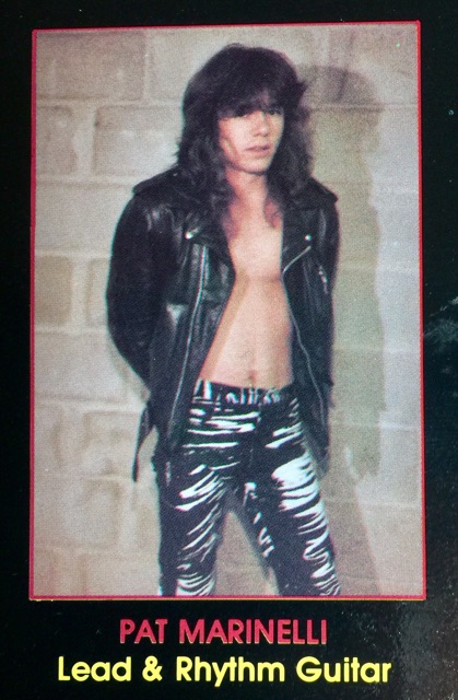
“Ok, tell me before you take the picture…ready…set…[snap]…oh Goddamnit!”

“Stay away from my fucking blow-drier Pat!”
And really, I’m being too hard on them, this is far from the most ridiculous set of band photos I’ve ever seen, I mean, is that the best you can do Attacker?
Wait, that’s not all…
What’s this? An insert inside the album? Let’s see what we have in here…
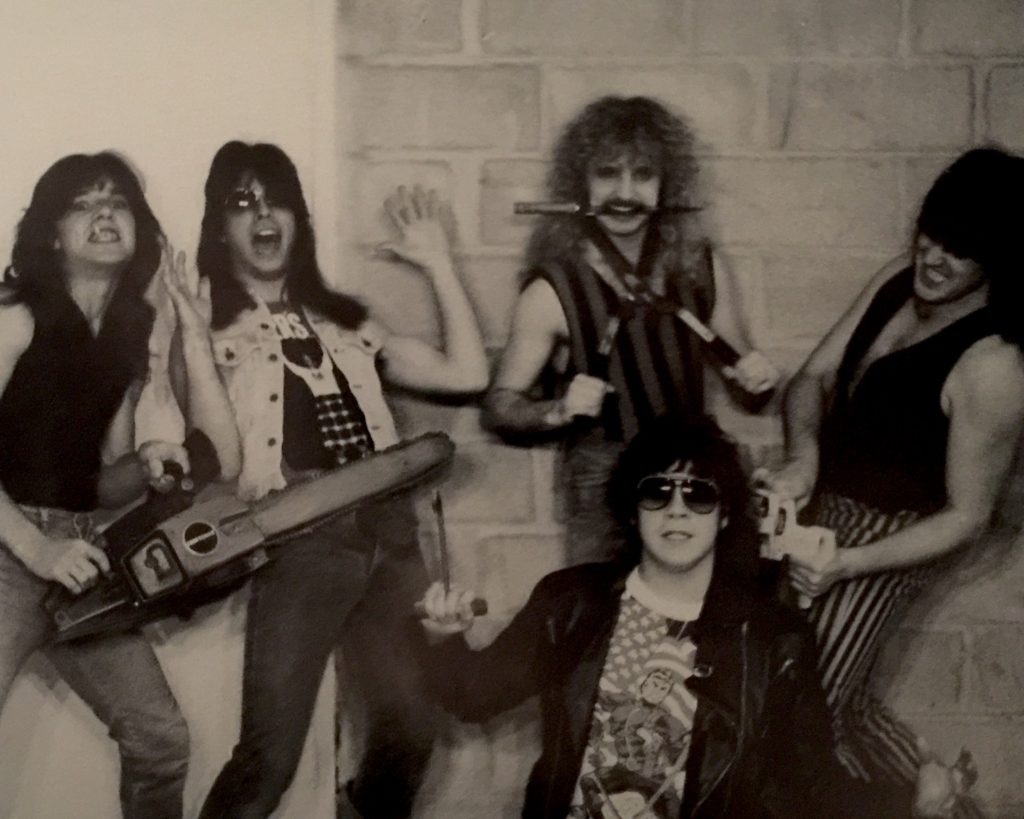
Oh my…
Quickly, clockwise from the left, we’ve got Pat making up for not being ready for his picture on the back by NAILING the pose with the chainsaw, Lou phoning in the least convincing display of fear I’ve ever seen, Michael winning the picture, album, and heavy metal in general by attempting to cut his own head off with garden shears, Jim hiding his belly behind a well thought out side-angle, and Bob looking convincing only when compared to Lou.
But seriously, those garden shears…amazing.
The Tolkien problem?
Alright, funny stuff, but let’s take a moment and get serious here. You see, it’s all fun and games when you are committing aesthetic crimes against humanity and forgetting basic rules of garden safety, but when you disrespect the professor and his work, then you and I have a problem! Because, as I’m sure you have all been screaming at your computer screen this entire time, there is not a goddamn thing on that album cover that happened at Helm’s Deep, or, indeed in any of Tolkien’s work. So what gives? Maybe the title track itself isn’t being depicted on the cover–and maybe its lyrics do a better job representing the last stand of Rohan:
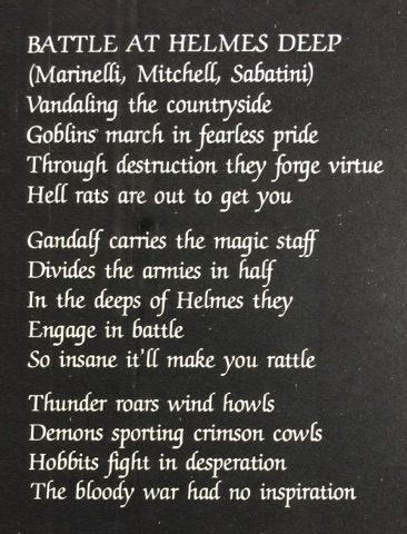
I don’t know what is most upsetting here, so I made a quick list:
- The fact that they misspelled “Helm’s”…twice!
- The fact that they seem to think the battle took place inside actual helmets…which is kind of deep, but still says nothing about their spelling abilities.
- Uruk Hai are NOT goblins!
- There weren’t any fucking hobbits at Helm’s Deep!
- Crimson cowled demons and hell rats? Oh Jesus Fucking Christ, you guys haven’t even read the book have you??
Seriously though, how does this happen? How does a metal band make it into adulthood without reading The Lord of the Rings? The mind boggles…or, at the very least, the mind is assaulted:
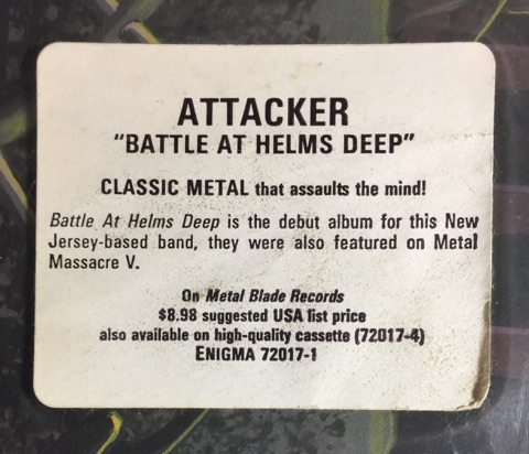
Yeah, but does the music suck?
Oh dear god no, this album in no way sucks. Despite a perhaps under-talented vocalist, Battle at Helms Deep is a bona fide classic of proto power-speed metal. But don’t take my word for it, just listen for yourself (and do your best to ignore the lyrics around 21 minutes in…)
One last shot at redemption?
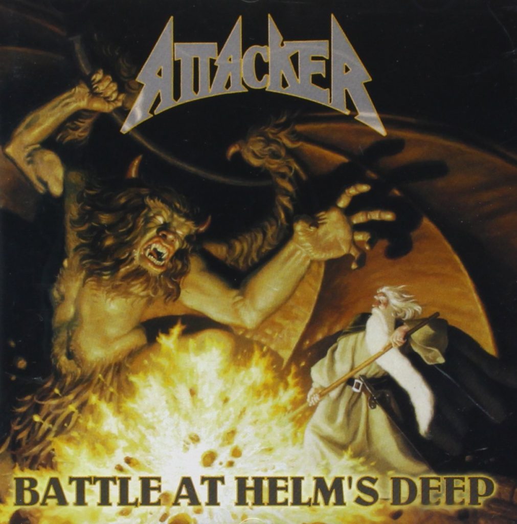
Now, perhaps in an attempt to appease the die-hard Tolkien fans out there, Attacker decided to re-release this classic album in 1999, THIS time, with ACTUAL Tolkien themed artwork (and even an actual logo!) So, how did they do? Did they finally set the hearts and minds of a legion of Tolkien obsessed metal fans to rest with a thematically accurate cover picture of the actual Battle at Helm’s Deep? Let’s see!
……
…………….
……………………………

God DAMN it Attacker…JUST READ THE FUCKING BOOKS ALREADY!
Leave A Reply