After a carefully (and repeatedly) xeroxed black and white photo of yourself wearing a robe in the snow, a proper logo is one of the most important elements in any black metal band’s packaging. The logo will instantly identify your music as, not only black metal, but also, if it is good enough, as black metal worth checking out. Today I will take a closer look at some of my all time favorite black metal logos to try to see what makes them work.
Perhaps it will be helpful to see what DOESN’T work before diving into the good stuff. So, here are a few handy rules I keep in mind when evaluating any band’s logo.
Rule 1: Don’t Szpajdel Your Logo
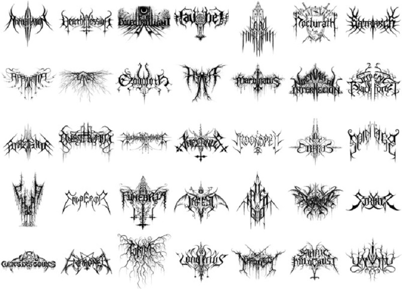
First up, when you think black metal logos, probably the first thing that comes to mind is the work of Christophe Szpajdel, designer of the Emperor logo…and (literally THOUSANDS (supposedly) of others):
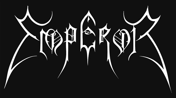
Now, Szpajdel’s Emperor logo is iconic stuff. The symmetry, Metallica-hooks on the first and last letters, the Old English font basis, it’s all there, and it’s a great logo:
But, partly due to Szpajdel’s prolific output, and partly due to Emperor’s overwhelming influence on all future black metal bands, I am completely over the played-out Szpajdel style.
Rule 2: Avoid Too Much Symmetry
I think the biggest problem with the Szpajdel style (and most black metal logos in general) is the perfect symmetry–a design choice that just lacks visual interest. Just look at this new logo for my beloved Sabbat:
Aside from the whole thing kind of breaking down into too many little curved crescent moons (and the out of place, too-thin inverted cross), it’s just kind of boring once you get over the “oh cool, it’s totally symmetrical!” initial reaction. It’s not a disaster, it’s still definitely a cool logo overall, it could just be better.
Rule 3: Cool it with all the Swirls and Dripping Shit
Also, logos with endless little dripping curls coming out every which way is ultimately a lazy way to add interest to a design that was probably bland to begin with:
Satanic Warmaster’s logo is pretty cool, but if you take off all the swirls and shit, what are you really left with? Just a good looking S and a bunch of Old English text.
Rule 4: Don’t Make it Look Like it was Designed in Illustrator
I know, when it comes to a logo, you want to put some time and effort into making it look professional, but too many logos in the black metal underground are far too cleanly drawn (dripping curls and all) for the music they represent:
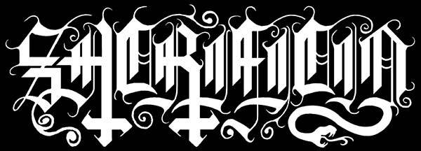
This logo for Sacrificio is fantastic, but it is so clinically drawn that it ultimately feels rather cold and robotic.
Rule 5: Don’t Draw a Bunch of Pictures
While I understand that black metal is not a musical style known for its subtlety, I tend to be drawn towards logos that are just logos, not logos surrounded by tiny drawings:
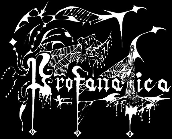
Profanatica has one of the all time great logos, but they went one spider web and jizzing angel too far with all the extra shit around it.
Rule 6: Make it Readable
Now, when I say make it readable, I don’t mean actually readable, but, at the very least, you should be able to see that there are actual letters in the logo:
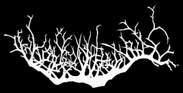
Despite Korgonthurus having a logo that basically aces every design rule out there, it’s so completely unreadable that it doesn’t quite make it as a logo. Though, the band is nothing special (and the fact that no one would ever call Krogonthurus a classic band also bars them from this list), so I have to assume any success they have is due to this logo popping up everywhere, so what do know, maybe this is the best logo on the list?
Rule 7: Cool it with the Trees
Speaking of trees and shit, I get it, trees are pretty sweet, and a tree based logo is going to be high on any list of logo design ideas for any black metal band out there. But, not only is the shtick both overused and kind of juvenile from a design perspective (OH, you like forests? I’ve got an idea….), it also makes your band look like one of those communes of west coast hipsters that insist deep knowledge of moon phases and wildflower lore are somehow requirements for entry to the hall:
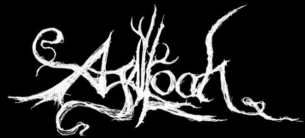
Despite this logo having a brilliant design logic behind it, unfortunately, Agalloch breaks my tree rule. Though, full disclosure, I can’t fucking stand Agalloch, so maybe this whole Rule 7 was just introduced to bar them from getting their just logo props. Ok, fair is fair, Agalloch’s logo is probably the single best log-o on this entire post. Still, let’s all dial back the tree shit.
Again, ALL of the logos discussed in these rules are not at all bad logos (many are examples of the best black metal has to offer). But for this post’s stringent standards, none of them quite make the cut. Here are the ones that I felt were good enough to be included in the top ten:
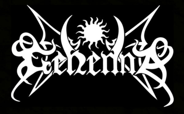
10.) Gehenna
This is really a fairly standard black metal logo, symmetrical, cleanly drawn, not a lot to make it stand out. But, a few things make it crack the top ten here. First, it is quite intelligently designed, with some nice subtle asymmetry with the G and A (as well as the h and first n) to give it a bit of visual interest. Also, the central sun is nicely incorporated, both within the uncommon central spikes, and within the visual design of the logo itself. The only thing I’d really think about changing would be to possibly remove the wings, as they kind of clutter up the design. However, without them I have a feeling it would not be eye catching enough to make the list here.
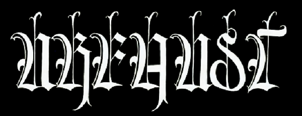
9.) Urfaust
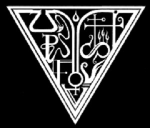
There is nothing wrong with simple Old English Text MT for your logo, it was plenty good enough for Bathory and Burzum after all. But, that will never get you on a great logo list. Urfaust makes it by adding a very unique repeated central ornamental bar to each letter, unifying the whole logo with a simple design conceit that I really haven’t seen a lot before. A great unique twist on a black metal classic, I like it even better than their very cool, but much busier sigil:
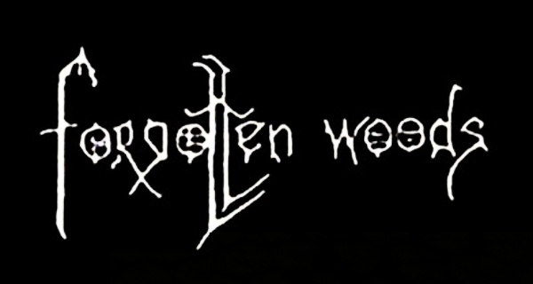
8.) Forgotten Woods
A logo this simple shouldn’t work this well, but the hand drawn aesthetic combined with some really nice, elegant design choices (I especially like the juxtaposition of the crossed r and g right next to the parallel lines of the ts. The brilliance of this simple logo is proof that you don’t have to go “full black metal” to create a fully black metal logo. They also, like Urfaust, have a great little accompanying sigil:
7.) Rotting Christ
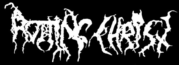
The Greek scene is full of great logos (Necromantia was a near include on this list), but Rotting Christ’s logo does just about everything right. From the nice use of a straight line on the top of the “otti,” to the “just obscured enough” horned thing over the second i, you can tell this logo had some thought put into it. And yet, the inelegance of the too-thin c and h (as well as a slight kerning issue between the i and s) belies a more improvised approach, which, while it has its charm, will also annoy you the longer you think about it. Still one of the all-time greats, even if it is almost more of a death metal logo than a black metal logo–but that’s where Rotting Christ started, so I suppose I can forgive it that.
6.) Varathron
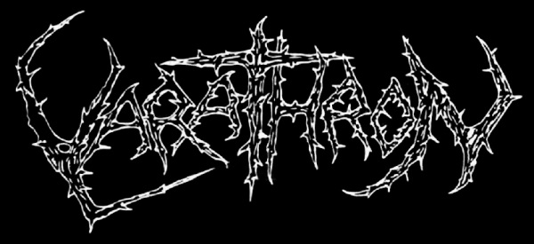
Varathron’s logo has always had a special place in my heart for its unique asymmetry. It builds its design around the focal point of that central T (in an unfortunate “right-side” up cross mode) with the bottoms of the “thro” continuing the upward tilt suggested by the bottom hook of the V. This would be higher on the list except I always felt like the V (and to a lesser degree, the N) had a little too much negative space to really incorporate well into the logo as a whole. And it is really pushing things as far as rule 7 (actually, no it’s not, those thorns are badass!)
5.) Peste Noire
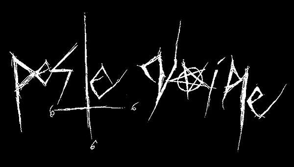
Now this is the kind of black metal logo that really makes me happy. It totally breaks from the Szpajdel mold, it’s simple, it’s hand drawn, and it looks evil as fuck (and not just because of the usual 666 stuff). Always high on my list when I discuss my favorite logos, my only problem with it is that that second to last letter looks nothing like an r.
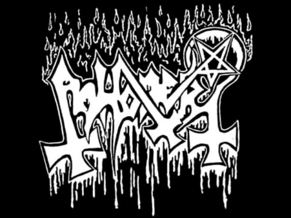
4.) Abhorer
Abhorer has a very cool logo (despite pushing things on the “dripping shit” front–though the contrasting fire and dripping shit works well), but what pushes it to the next level is that diagonal upside down cross! I normally don’t go for GIANT upside down crosses dominating the design (which, yes, I realize this is black metal, but still, show some restraint!), but in this case that one simple design choice makes for both a visually pleasing and immediately identifiable logo. Extra points for working in some letters in front of and behind others without getting cluttered (in black metal terms)!
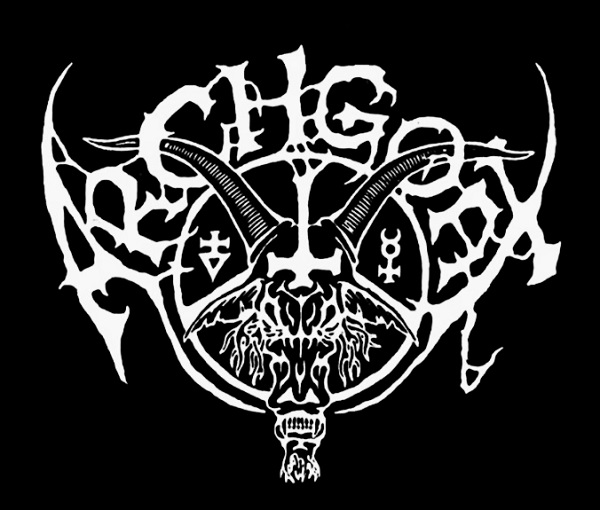
3.) Archgoat
As I said, make logos, don’t draw a bunch of pictures. Archgoat gets a pass though, because their iconic logo incorporates its picture so well that I can’t imagine the logo or the picture by itself. This one works on the micro (each design element is skillfully placed next to the others) and the macro (the sum of all the parts create a new, pleasing whole) levels, and is, in my mind, Moyen’s best work (though, the old Beherit logo is pretty sweet too). Thankfully the letters have a nice hand-drawn look to them or I’d say this one is in danger of looking like a corporate automobile logo–it’s that finely crafted.
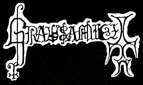
2.) Grausamkeit
I realize this one shouldn’t be this high on the list, but, for many of the same reasons Grausamkeit is one of my favorite bands (basically: an obscene amount of lo-fi charm), this is one of my favorite logos. Everything, from those classy as FUCK upside down crosses (with nicely contrasting sizes), to the totally hand drawn old english letters, to the fact that this was obviously just cut out of the sheet of paper he drew it on screams TRVE about this logo. It’s so good that I can forgive the slight (and, I assume, unintended) upward tilt and the way too thick line between the k and the e.
1.) Dark Throne
Yes, Darkthrone is the reason people need to cool it with the dripping shit (in addition to being the reason people need to cool it with the NS shit), but, unlike most of their contemporaries, when you take away the dripping shit, this logo loses none of its power. With its inherent symmetricality tempered by some nice randomly branching letter tails, Darkthrone, one of the most iconic of all black metal bands, has created a logo that matches their importance in the genre. Readable without losing sight of black metal’s penchant for illegibility, this logo utilizes its brilliant outer shape to its fullest extent, creating a visually pleasing, multi-level logo that, 30 years in, has yet to be matched.
Finally, I genuinely love the music from all these bands. To decide for yourself if the music matches the logo quality, check out this handy playlist featuring songs from all bands here:



8 Comments
I enjoyed this a lot – looked through it several times. I’d probably rank some of these differently, of course. In particular, Rotting Christ is much better than #7 for me – probably #2. Peste Noire wouldn’t have made the list. Also, yeah, the Agalloch logo is really good – maybe not the best in the entire post, but at least better than half your list. It’s also perhaps a bit unfair to pick on trees as being “kind of juvenile from a design perspective” in a post like this (OH, you like Satan and hate Jesus? I’ve got an idea…)
Agreed on Rotting Christ…originally it WAS my number 2 as well…but the more I looked at that too skinny C, the more annoyed I got. I’m sure I’ll come back around to see it as a whole and remember that it IS one of the all time greats, but looking too closely took it down a few notches for me. I just have a weakness for scratchy shit like that Peste Noire logo (see also: old Ungfell). And, I’ll give you that on no fair calling trees juvenile…THOUGH, most bands that switch to trees do so because all the giant upside down crosses are juvenile…get off your high horses hippies, you’re doing the same shit.
Any logos you think should have made the list?
I’m not saying any of these should absolutely make the list, but here are some others I like:
Enslaved
Samael
Immortal
Summoning
Beherit
Mystifier
Ulver
Oranssi Pazuzu
Strid
Enslaved – One of my all time favorites, could definitely make the list, love how it feels like a spider! I just wish they would have cleaned up the overlapping crosses at the bottom…also the slight curve of the crosses always threw me off (old logo or GTFO).
Samael – Old logo as well? Great logo, but I see this a lot, bands try to outline a logo and then have a hard time figuring out how to outline the negative space between the letters leading to inconsistent results. The non outlined version is good, but I feel like it has a bit too much awkward negative space.
Immortal – I never loved this one. It’s fine, but the MM and RTA are too crammed in there (and unimaginatively shaped), and overall the whole thing just feels too busy.
Summoning – Classic, immediately identifiable, unique, and very cool. On the other hand, they just made their letters look like a pentagram, which always felt a little silly to me (yes yes, it’s black metal, I know). I definitely debated putting it on my list.
Beherit – Yeah, that old logo kicks ass. Could have easily made the list.
Mystifier – Cool logo, and very unique. But the wavey style of the letters makes it look a little amateurish (though they do a decent job of incorporating that giant upside down cross.
Ulver – Fantastic logo. But lion tails and cursive just aren’t very black metal.
Oranssi Pazuzu – The shape of the bird is cool, but, like the tree stuff, I never loved the “make a logo the overt shape of something else” style. Should I check the music out more though? Pretty sure I have never made it more than 5 minutes into their albums…
Strid – The overall shape and that central shield is very nice…but focusing in, the letter shapes feel uninspired.
mysticum
Gehenna’s logo does rule, I believe it’s a Szpajdel work as well. That Urfaust sigil is brilliant. Nothing but love for Varathron and Archgoat, and the Emperor and Darkthrone are iconic.
Some of my favourites include:
Conqueror
Revenge
Sadistik Exekution
Mortuary Drape
Black Witchery
Mysticum
Nyogthaeblisz
The latest Hellvetron iteration
Ptahil
Absu
Necromantia
Black Majesty
Mare
Vlad Tepes
Horns (from Chile, not Horna lol)
Panphage! Darkspace! Ancient Wisdom! Windir (early)! Isengard! Summoning! Throne of Ahaz!
Great article! I share and agree with the author’s opinion on most points. Fortunately, there are many artists today worth following who are striving to bring something new into the world of logo design.
For example, there is an artist named Thomas Bokler, also known as Gnoizm, and every time I eagerly await each of his new works, because he manages to both follow and break the rules in an original way, in the spirit of creative freedom and the primordial essence of metal. If you are interested, I can also point out some other artists, but then my comment would become too long. Thank you for the insightful material!